Small businesses invest a lot of money and time into their website, so naturally they’re disappointed when their site doesn’t generate the leads they were hoping for. Most are perplexed by the lack of conversions or even low traffic to the site in the first place. Sometimes a little TLC is all your site needs to start those leads flowing again. Let’s talk about how to get more leads by making your website more user-friendly.
Give the people what they want
 The biggest way to attract more people to your website and make sure they actually stick around for more than a few seconds is to provide information that people are looking for. Too often, businesses turn their website into one big sales pitch; talking about features but not about benefits. In other words, if your site does nothing more than tout all the wonderful services you offer without connecting those services to how they’ll help the prospect, you’re going to lose leads. People visit your site because they have a problem that they need help with; your job is to clearly show how your product or service can solve that problem. How can you give the people what they want? Listen to them! What questions are people asking you over and over? Provide that content on your site. What problems do your services address? Spell it out. What are the benefits of what you provide to your prospective customer? Clearly illustrate that on your website. Take the time to ask your regular site visitors or even your existing clients what they’d like to see on your website. Getting input directly from your target audience will allow you to discover missing elements you might not see on your own. Users often know precisely what they like or don’t like about a website. Take that feedback and apply it to your website.
Make your site easy to navigate to get more leads
 There are entire companies whose only service is helping website improve their user experience or “UX”. Why? Because it’s a really big deal. If people have a poor experience on your website, they’ll bounce and go somewhere else. One big pain point of UX is difficulty navigating a website. This is especially true on mobile versions of websites. Your website should be easy to navigate; almost intuitive in design. That starts with an easy, straightforward navigation bar. The navigation bar is essential because it follows the site visitor throughout their journey on your site and serves as a tool to go back to the landing page. Really put some thought into how your website navigation should flow. Take the time to do a basic wireframe. It can be as basic as creating a basic flow in an Excel spreadsheet, just to visualize how people will flow through your site. The idea is to make information as easy to find as possible. And by all means, make sure that navigation translate to mobile search too!
Patience is a virtue your site visitors don’t have
 While you might think that your site is worth waiting for, other people don’t, so make sure that your site speed is up to snuff. According to Kissmetrics, 47 percent of visitors expect a website to load in less than 2 seconds, and 40 percent of visitors will leave the website if the loading process takes more than 3 seconds. The challenge is finding out what items may be causing your site to load. Here are a few possible culprits:
- Server performance
- Increased traffic
- Extra-large images
- Code density
- Too many file requests
- Too many plugins
- Too many redirects
If you suspect your site has load issues, a good tool to use to check it out is GTmetrix. You can test your site for free and then review their results and recommendations to improve performance. Some will likely be easy fixes (like those bloated, oversized images) while others may require a phone call to your hosting company. It’s worth investigating!
Make your lead form easy to find
 You’d be surprised how many websites make it difficult to actually contact someone. If visitors have to hunt and peck to find a contact form, email address or phone number, you’re going to lose leads; it’s that simple. A few easy options include adding a static sidebar contact form (so it’s always visible regardless of what page a visitor is on), add contact information to your header, add contact information to your footer, or clearly add “contact” as an option in the top navigation menu. Also make sure that you provide more than one way to contact you. Not everyone likes to pick up the phone, so providing options to email, text or chat are great ways to make contacting you as easy as possible.
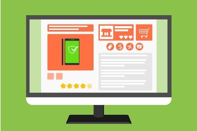
A picture tells a thousand words
How text heavy is your website? Sure, you need to provide helpful information, but if visitors are hit with a sea of words when they land on your site, you may lose them. Add visuals to make the content more appealing and to break up the text a bit. You can also use bullets or other ways to break up text and make it more easily scannable. No one wants to read a bunch of text to get the info they want; make it easy for them to learn about your company and how you can help them.
Tell visitors what to do on your site
 Your site should have several calls-to-action (also known as CTAs). These aren’t high pressure sales tactics; they simply tell the site visitor what to do next to get the information they want. Common CTAs include:
- Call now
- Contact us
- Get your free download
- Sign up for our newsletter
- Start your free trial now
Visitors to your website want to know how to take the next step. Make this simple by using a strong CTA that’s easy to locate on your website. It’s OK to be Captain Obvious when it comes to CTAs. Help people do business with you!
Working on site UX is not a one and done
Commit to frequently reviewing your website to see how you can make improvements. Constantly strive to make it easier to navigate your site on both a desktop and mobile. Do A/B testing on your CTAs to see what resonates. Keep an eye on your image sizes and monitor your site speed. You’ll get more leads by making your website more user-friendly, so commit to making this an important part of your ongoing website maintenance strategy.

- Marketing Tactics That Your Small Business Can Do for Free - January 10, 2024
- How to Create Images for Your Small Business Website - December 6, 2023
- How Small Businesses Benefit from Referrals - November 6, 2023